|
|
发表于 4-9-2015 10:52:49|来自:新加坡
|
显示全部楼层
Market Valuation, Inflation and Treasury Yields: More Clues from the Past
September 2, 2015 by Jill Mislinski
Our monthly market valuation updates have long had the same conclusion: US stock indexes are significantly overvalued, which suggests cautious expectations on investment returns. In a "normal" market environment -- one with conventional business cycles, Federal Reserve policy, interest rates and inflation -- current valuation levels would be a serious concern.
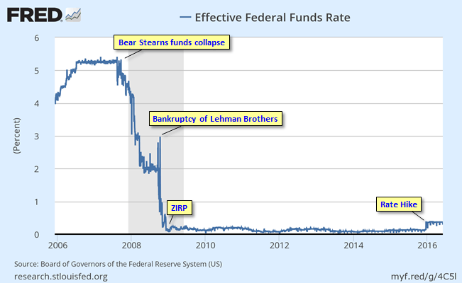
But these are different times. The economic cycle shaped by the Financial Crisis that began emerging in 2007 shortly after the Bear Stearns hedge funds collapsed. The Fed began its historic crusade in cutting the overnight rate from an average of 5.25% prior to the hedge fund collapse to ZIRP (Zero Interest Rate Policy) as of December 16, 2008. The bankruptcy of Lehman Brothers on September 15, 2008 was the most dramatic precipitator of the Fed's unprecedented policies.
In the wake of the Financial Crisis, inflation has been low and the 10-year Treasury yield is hovering about 70 basis points above its historic closing low of 1.43% set on July 25, 2012 (the monthly average that month also an all-time low of 1.53%). So, with this refresher on the Financial Crisis in mind, let's take another look at the popular P/E10 valuation metric.
Here is a scatter graph with the market valuation on the vertical axis (log scale) and inflation on the horizontal axis. It includes some key highlights: 1) the extreme overvaluation of the Tech Bubble, 2) the valuations since the start of last recession, 3) the average P/E10 and 4) where we are today.

The inflation "sweet spot", the range that has supported the highest valuations, is approximately between 1.4% and 3%. See, for example the highlighted extreme valuations associated with the Tech Bubble arbitrarily as a P/E10 of 30 and higher. The chronology of the orange "bubble" on the chart is a clockwise loop of 56 months starting at the 6 o'clock position. The P/E10 was 31.3 and the annual inflation rate for that month, June 1997, was 2.30%. The average inflation rate for the loop was 2.41%. The P/E10 peak of 44.2 in December 1999 was accompanied by a 2.68% annual inflation rate. Two months later the inflation rate topped 3% at 3.22%. The right side of the loop shows what happened thereafter. The ratio slipped below 30 for two months (the tail at the bottom of the loop) before its final three-month swan song in the 30+ range.
The latest P/E10 valuation is 25.5 at a 0.51% year-over-year inflation rate, which is below the sweet spot mentioned above.
And speaking of that 30 threshold for the P/E10, prior to the Tech Bubble, only two months in history had a ratio above 30: They were 31.5 and 32.6 in August and September of 1929, just before the Crash of 1929. Research estimates put the annual inflation rate during those two months at 1.17% and 0.00% (zero).
P/E10 and the 10-Year Treasury Yield
A common question is whether a valuation metric such as the P/E10 has any merit in a world with Treasury yields at current levels. Investors who require portfolio growth might indeed be motivated to disregard historic indicators that warn of an overvalued market. But what does history show us about the correlation between the P/E10 and the 10-year constant maturity yield? The next scatter graph offers some clues. The horizontal axis has been switched to the 10-year yield. The chart uses a log scale to better illustrate the relative yields values.

In the months following the Great Financial Crisis we have essentially been in "uncharted" territory. Never in history have we had 20+ P/E10 ratios with yields below 2.5%. The latest monthly average of daily closes on the 10-year yield is at 2.17%, which is 64 bps higher than its all-time average of 1.53% in July 2012. The closest we ever came to this in US history was a seven-month period from October 1936 to April 1937. During that timeframe the 10-year yield averaged 2.67%. How did the market fare? The S&P Composite hit an interim high (based on monthly averages of daily closes) in February 1937. The index plunged 44.9% over the next 15 months.
If we look to the Dow daily closes during that period, the index hit an interim high on March 3, 1937 and fell 49.1% to an interim trough on March 31, 1938 — 13 months later.
What can we conclude? We have been in "uncharted" territory. Despite the end of QE, many analysts assume that Fed intervention through its Zero Interest Rate Policy (ZIRP), will keep yields in the basement for a prolonged period, thus continuing to promote a risk-on skew to investment strategies despite weak fundamentals.
On the other hand, we could see a negative market reaction to a growing sense that Fed intervention may have its downside, resulting in an aberrant bond market and increased inflation/deflation risk.
We are indeed living in interesting times.
Note: For readers unfamiliar with the S&P Composite index, see this article for some background information.
To support our characterization of the current Effective Federal Funds Rate as "unprecedented", here is a snapshot of the complete FFR series available from the FRED repository.
|
|


 IP卡
IP卡 狗仔卡
狗仔卡 提升卡
提升卡 沉默卡
沉默卡 喧嚣卡
喧嚣卡 变色卡
变色卡 显身卡
显身卡